


Mountain Safety Research (MSR) produces camping, hiking and mountaineering gear, like portable stoves, water filters, snowshoes, and tents.
We designed a built-in fundraising platform where MSR customers can start campaigns or contribute effortlessly. My main responsibility was to design the contribution flow.
In November 2016, MSR ran a successful Indiegogo campaign to provide water treatment devices in developing areas across the world. They realized they have a very interested community of supporters, so to actively engage that community, they brought us on to create a dedicated fundraising platform.
MSR had a few requirements:
- They would run their own fundraising campaigns but anyone could go on the platform and create a campaign, which would go live after approval from MSR. All funds raised would go to MSR.
- The platform would be an add-on to their existing website, which was built on WordPress. This meant that we had to follow existing style guides and some design choices were made based on whether it could feasibly be implemented in WordPress.
Beyond that, we also decided we wanted to make the donating process shorter and easier than in competing fundraising platforms.
We started by researching similar fundraising websites and creating a competitive matrix. Two stood out in particular: Indiegogo because it is a popular way to fundraise for anything and MSR had used it before, and charity: water because of its similarity in background and purpose. From there, we compiled a list of core features that needed to be included in the final design.
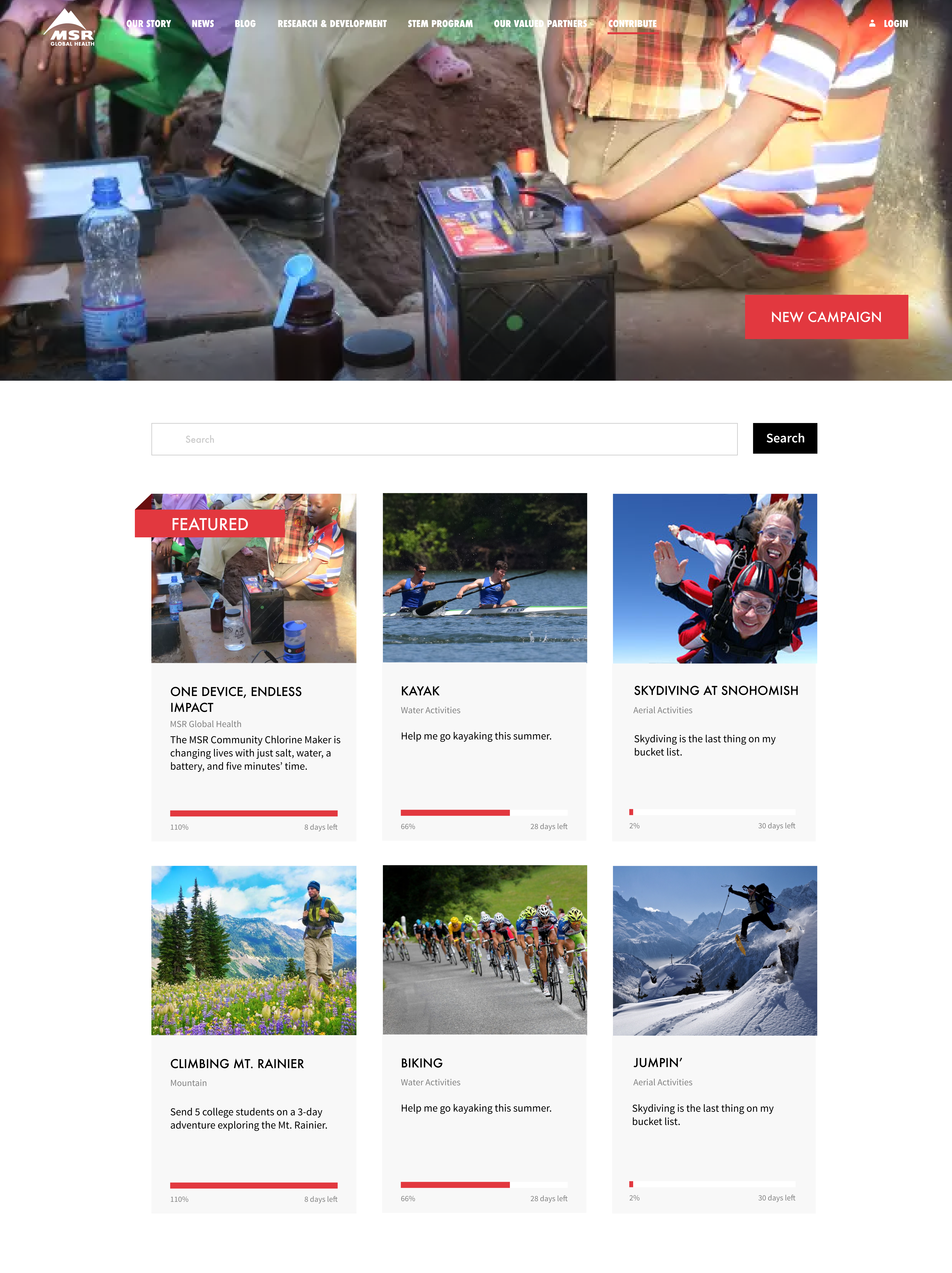
Core Content
Before heading into wireframes, we created user maps for a few different personas to make sure we covered all screens that may have been accidentally skimmed over.
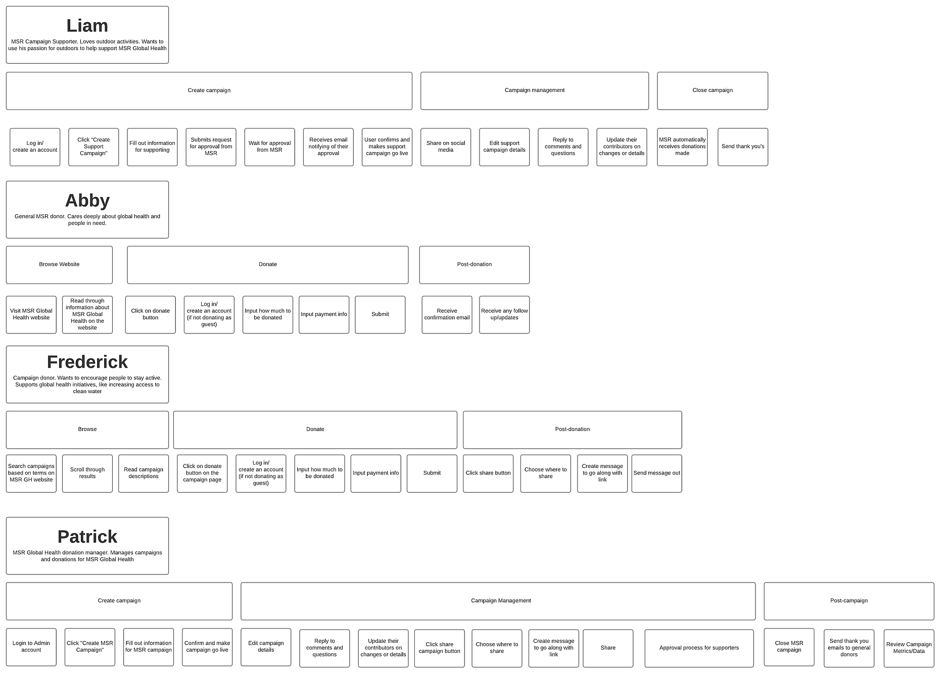
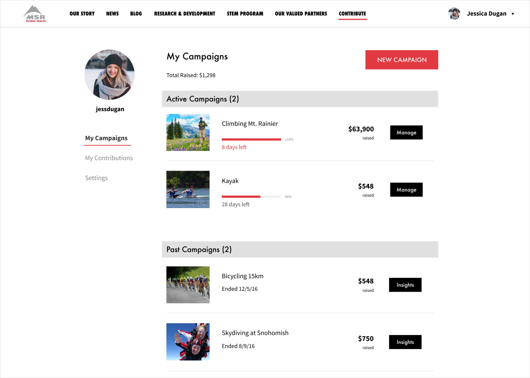
There would be 3 main ways for the general public to interact with the site:
- Create a fundraising campaign.
- Contribute to a specific fundraising campaign, whether MSR’s or another individual’s. Funds would ultimately go to MSR but it would provide support for that particular cause.
- Make a general contribution. This would just go directly to MSR for general global health-related activities.
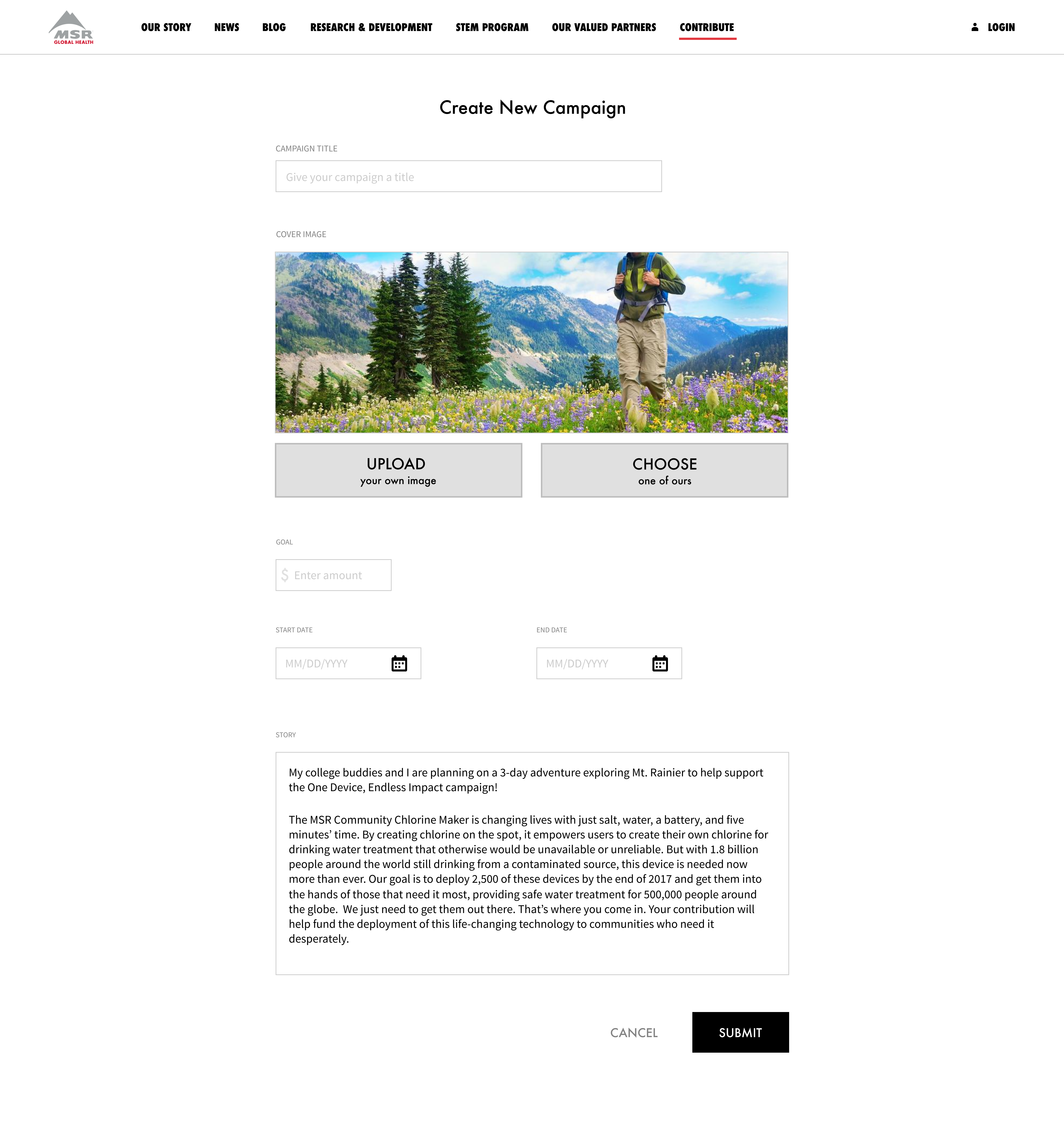
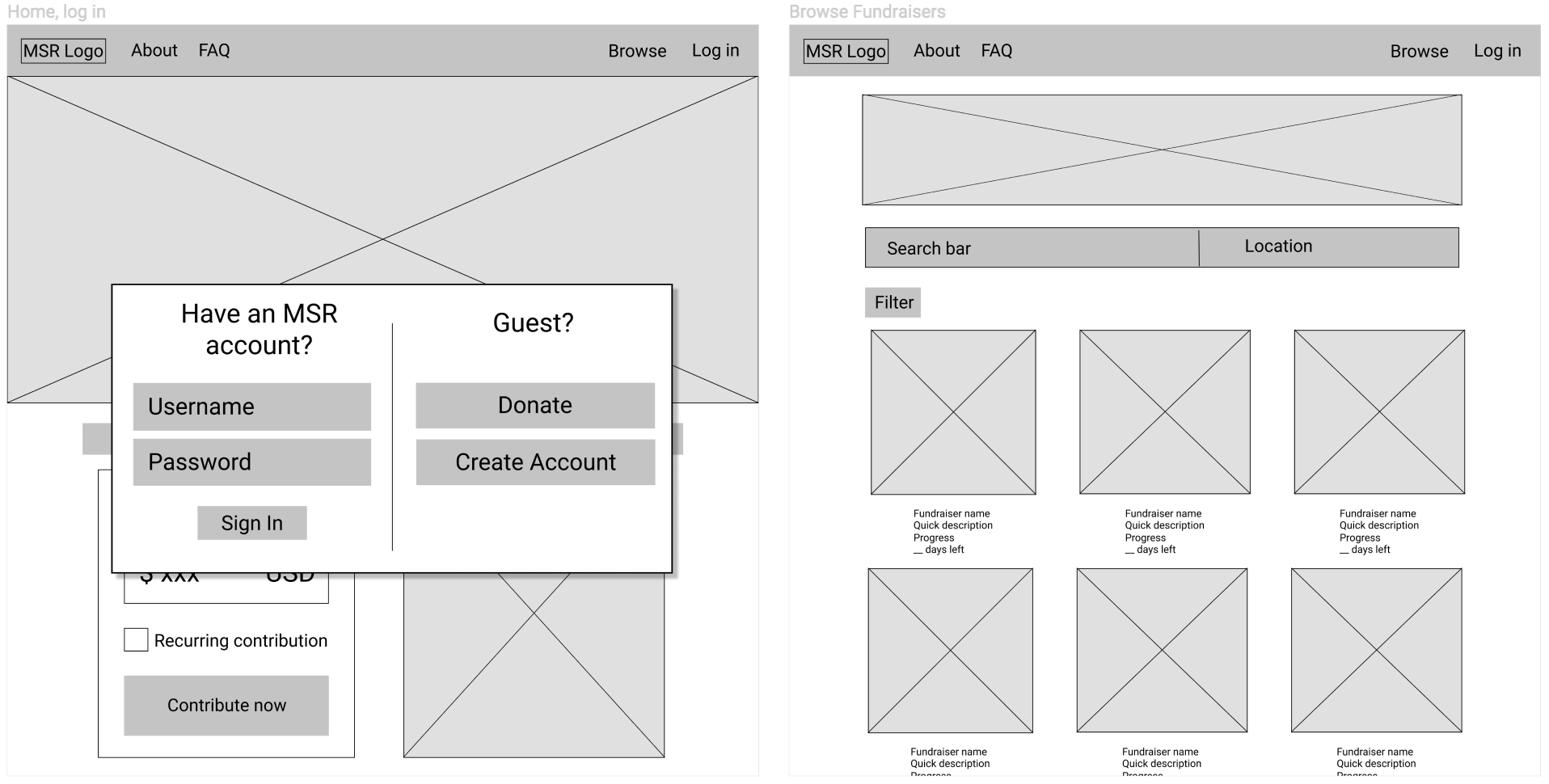
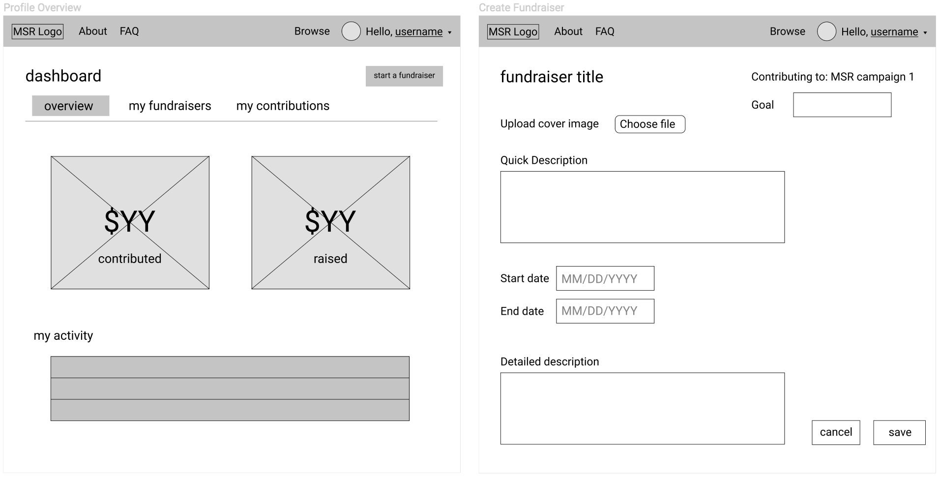
In our first wireframes, we focused on the content that needed to be included and making sure the platform was structured in a way that would fit with the existing site.
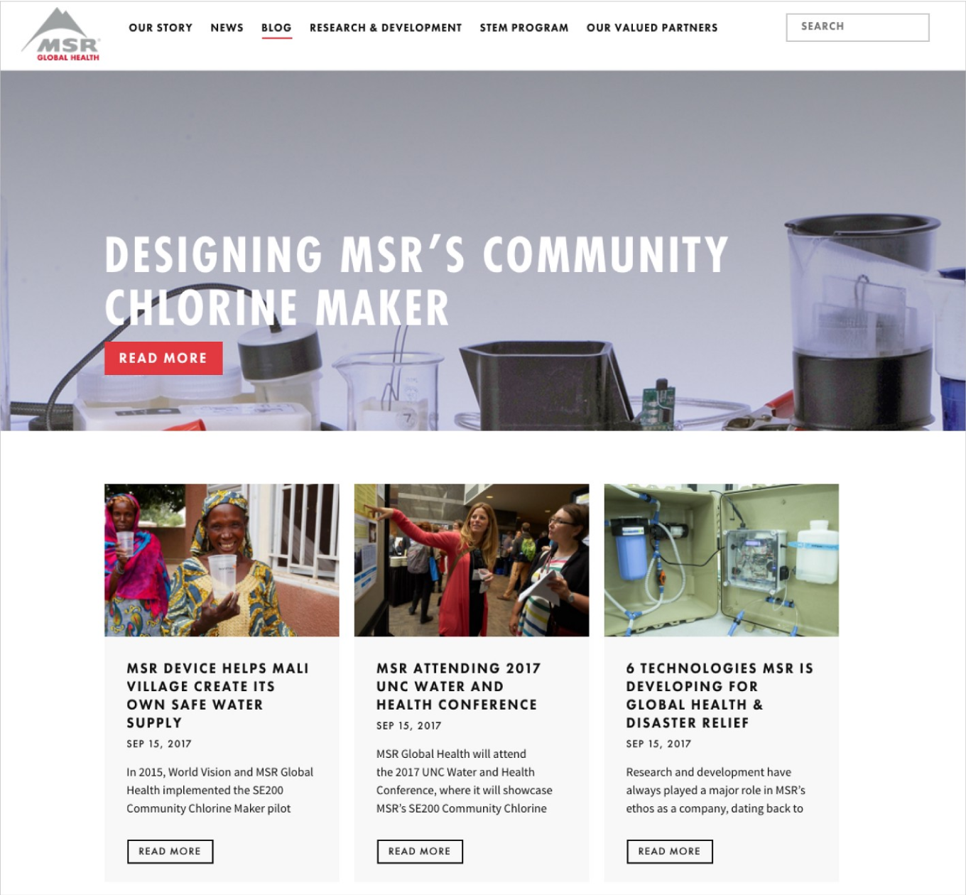
For example, the layout of the browse fundraisers screen (below right) is done similarly to MSR’s blog page (above) with a banner image at the top and tiled entries below.
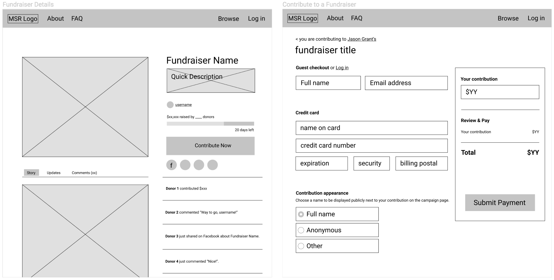
As for other screens, we started out by drawing inspiration from Indiegogo because, as such a full-fledged site, it seemed likely that their content would be relevant to us. I later realized that Indiegogo was far too generalized and MSR’s customers only needed a small part of what it provides, but I’ll get to that in the next section.
Usability Testing
After creating a more hi-fi prototype, we performed 4 usability tests, from which we learned the following:
- The actual contributing process was easy and straightforward.
- The difference between MSR campaigns and other fundraisers was unclear.
- The design didn’t explain the different ways to contribute enough for participants to know the differences between each.
As we incorporated this feedback and continued testing revisions with users, I started noticing a few key improvements in the content and interactions I had designed.
Indiegogo Does Too Much
The biggest problem, originally, was that Indiegogo did a lot more than what MSR’s customers needed. Our fundraising platform only needed to meet MSR’s customer’s needs, and when I realized we were accounting for more than that, we trimmed.
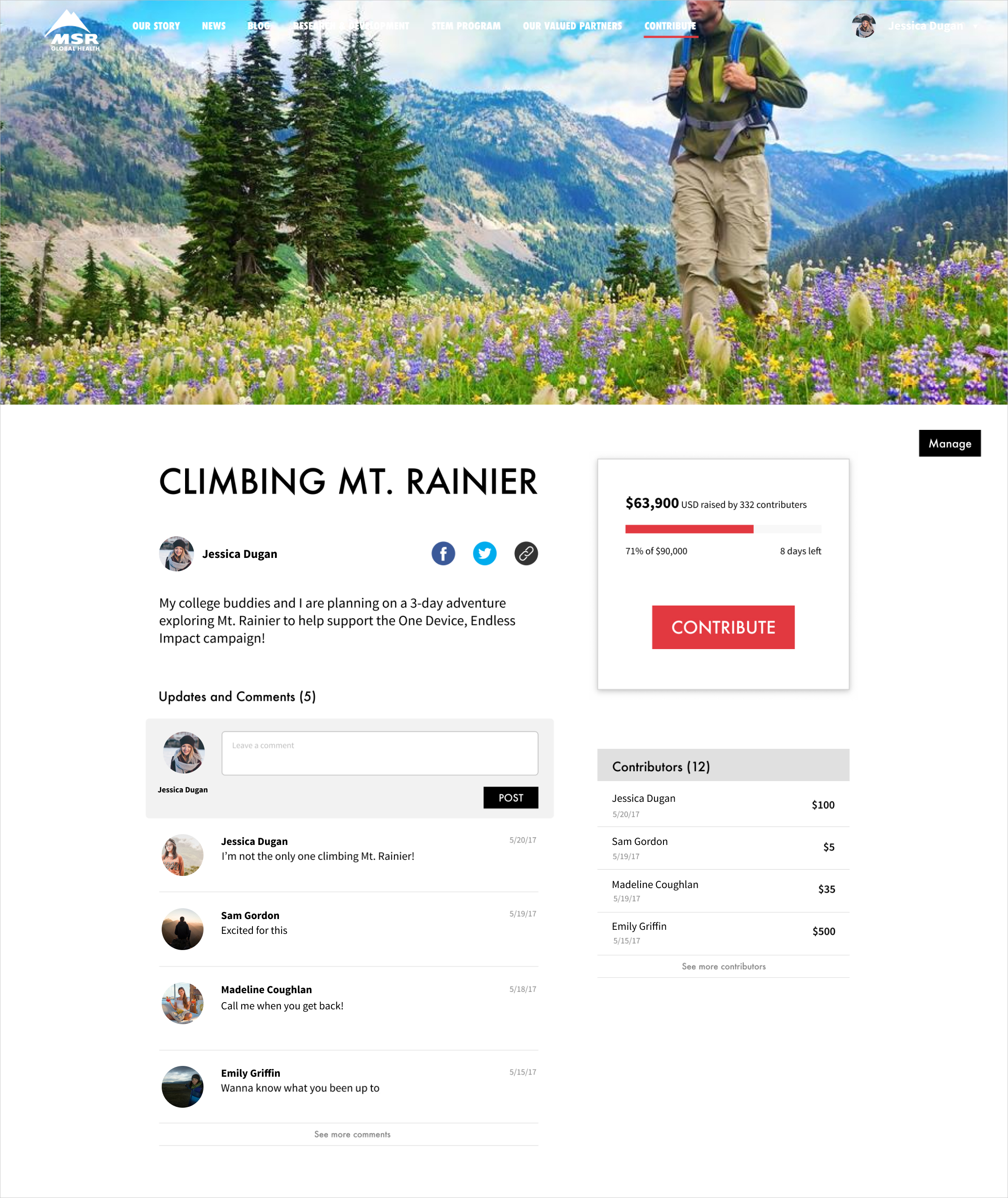
For example, on the campaign page, a longer story description was unnecessary as there usually wasn’t as much to explain.
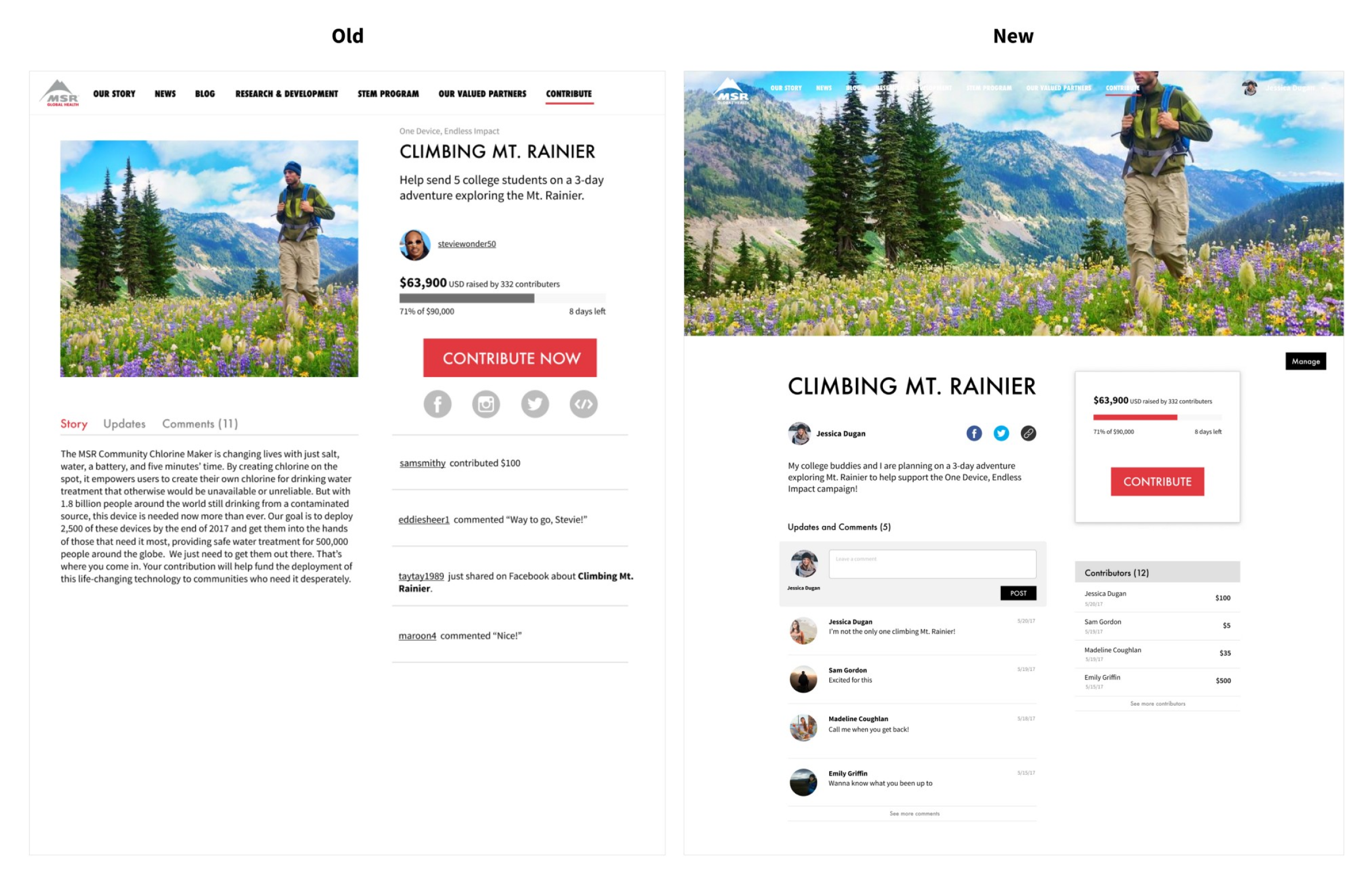
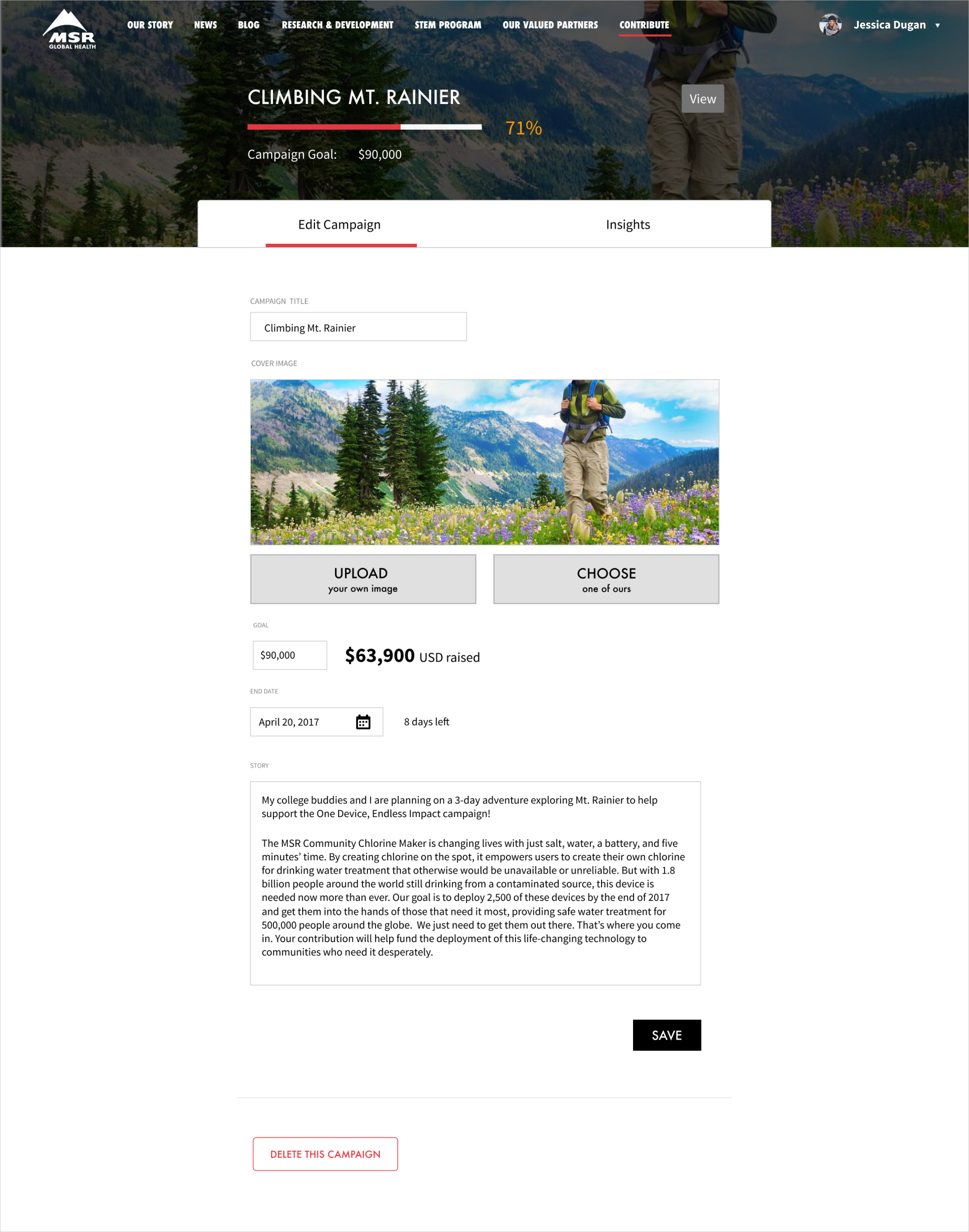
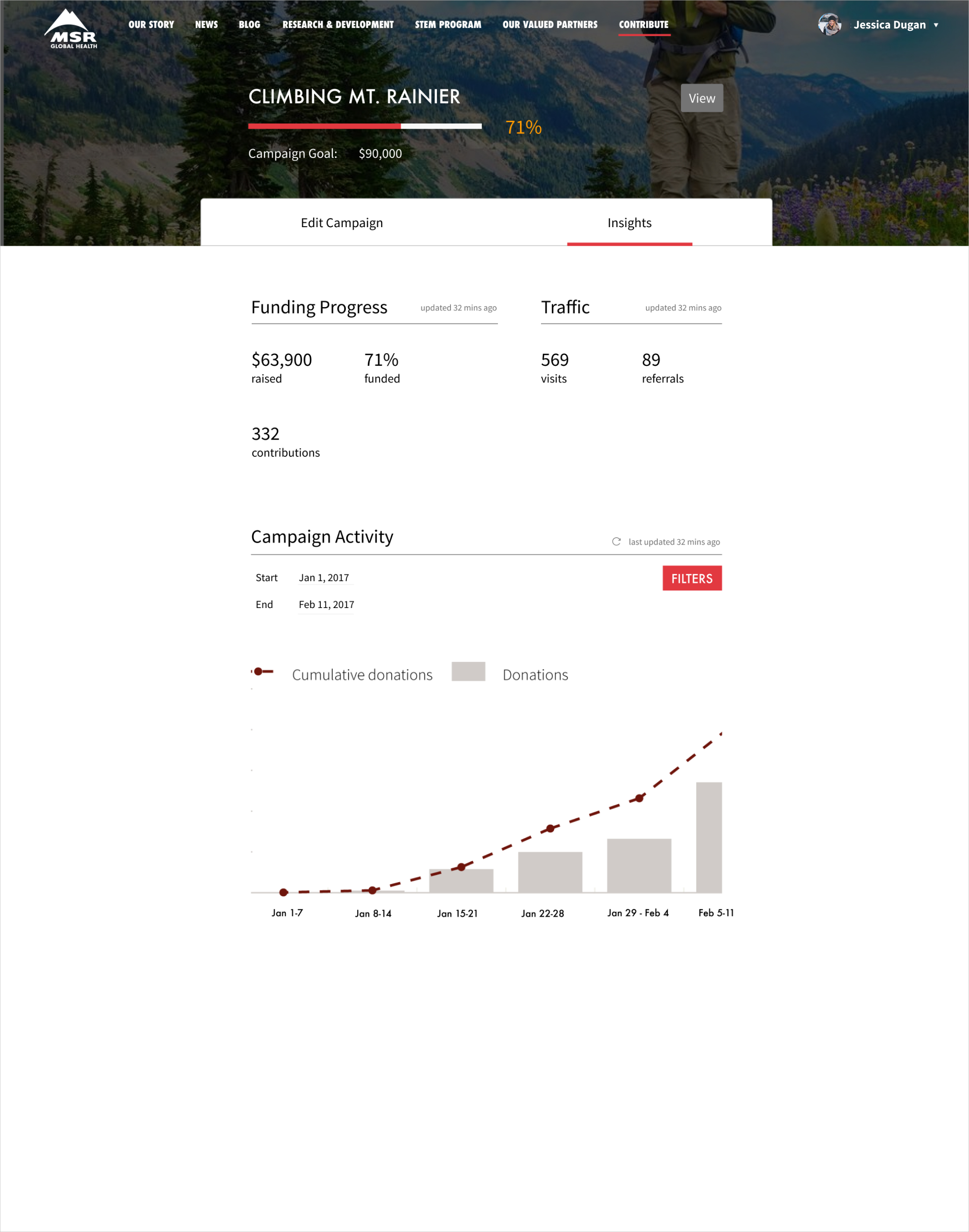
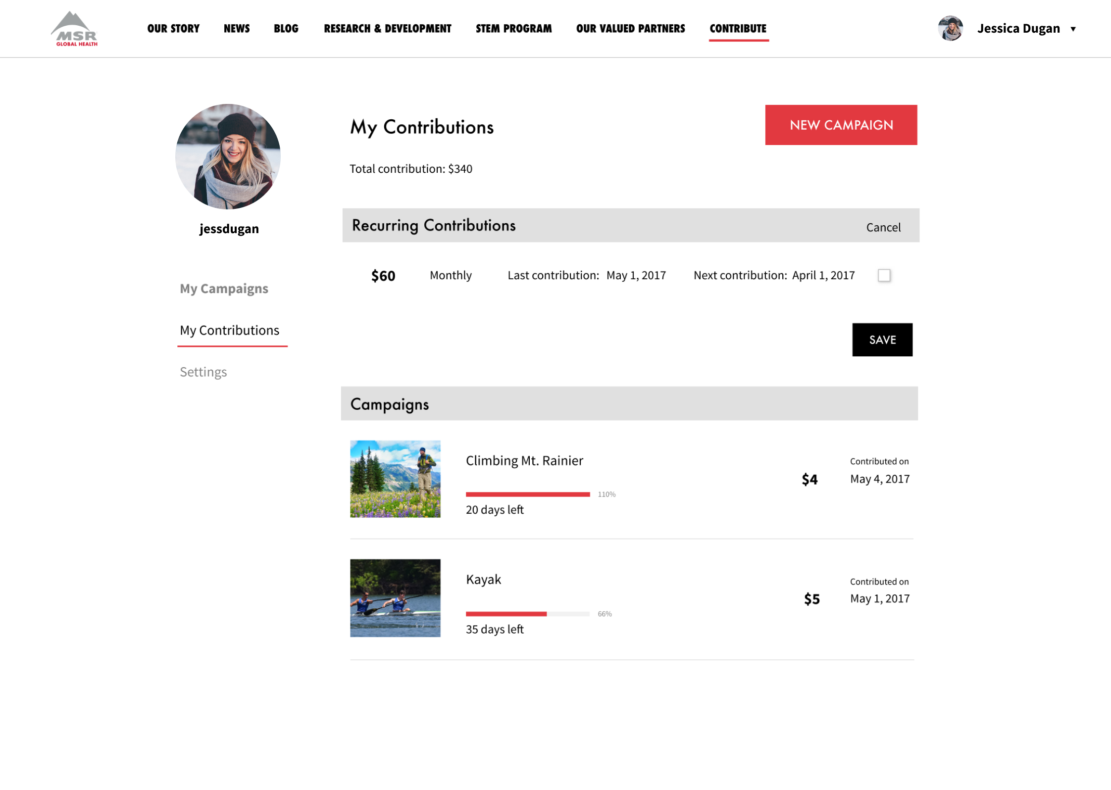
In the old version, there was also a feed that showed everything that happened related to the fundraiser, but while interesting, it really wasn’t relevant to the fundraiser’s goals. It also included a lot of repeated information. In the final design, we instead show information on contributors, highlighting contributions in an appreciative gesture.
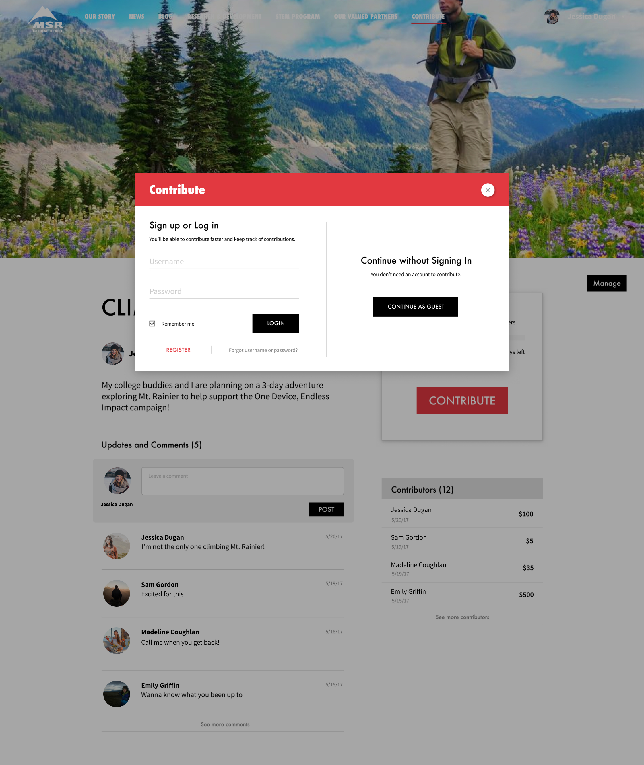
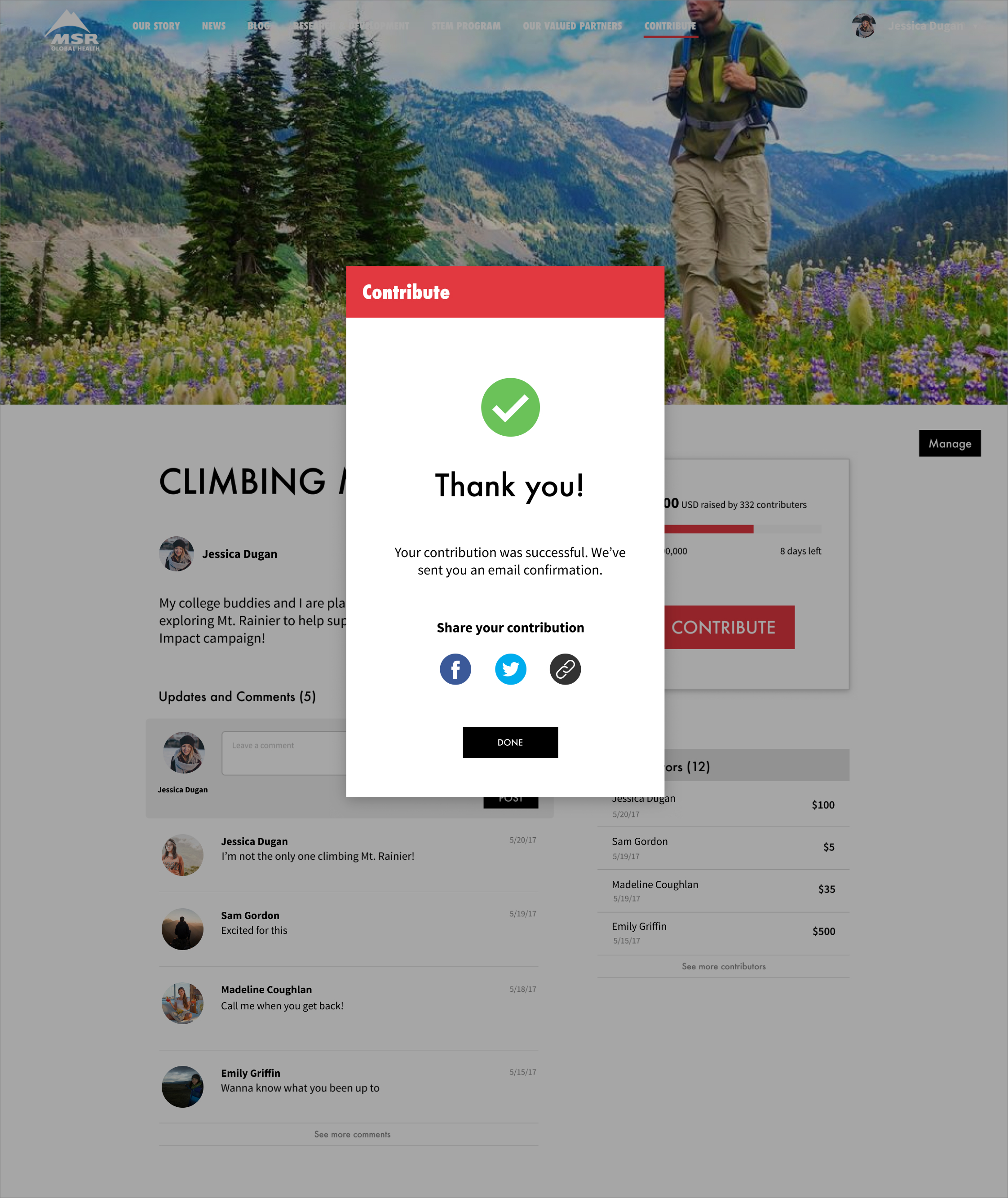
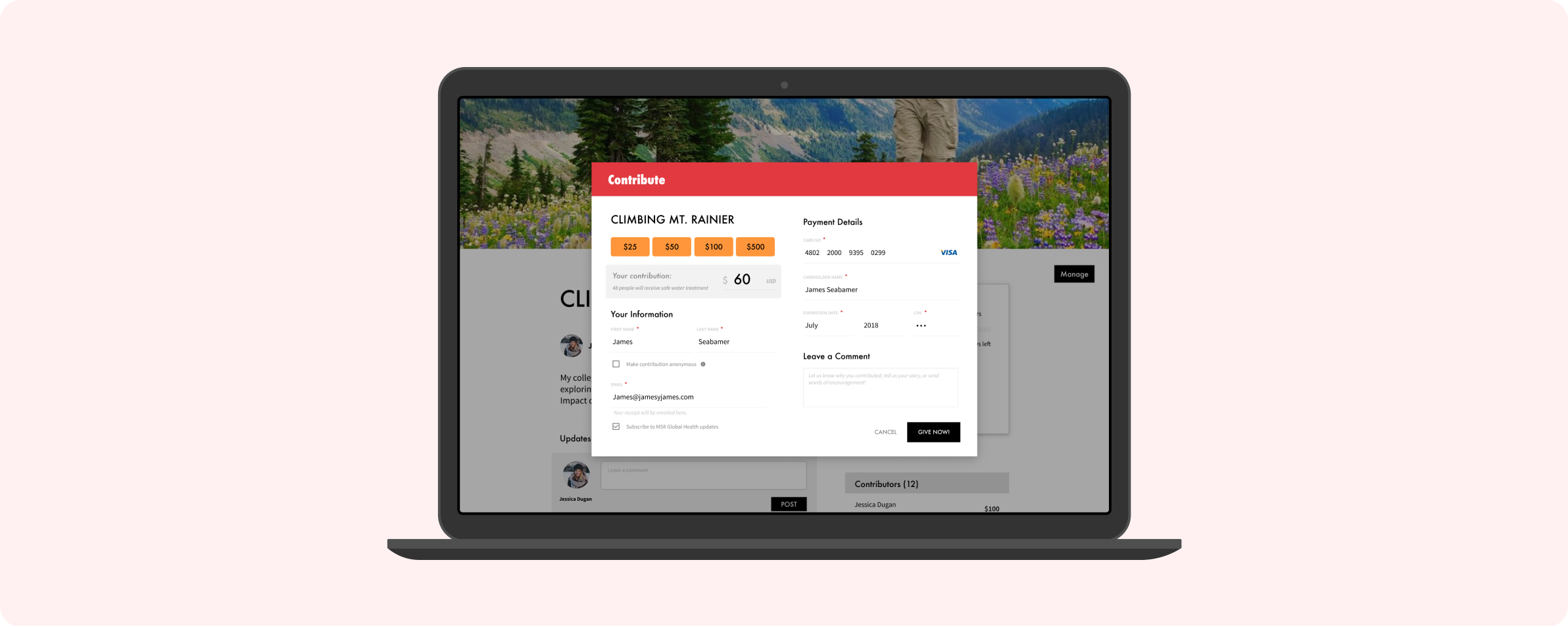
Contribute Popup
One of my biggest focuses during this phase was the contribute popup. We had decided to use a popup instead of redirecting to a new page to meet the team’s goal of making the contribution process feel easier than in competing platforms. For the most part, our first iteration seemed to function well. It was quick, simple, straightforward — it got the job done. But that’s also all it did. It was like any other payment form but just in a popup instead of a new page.
Another issue was that although the popup form did make contributions feel easier, we ran the risk of feeling less secure. Not good for a payment form.
One final issue mentioned in usability testing was that the user had to input the amount they wanted to contribute on the first page, then the popup would show up, and then if they wanted to change the amount, they would need to start over. I had originally designed the flow this way in effort to create a more secure feeling, as though the user is “locking in” the number, but instead it became somewhat of a wall for users to contributing.
So in the next version, I tried a few different things.
Round 2
(Side note: To make the distinction between MSR campaigns and user campaigns clearer, I explored a different campaign / fundraiser structure in which all user fundraising campaigns would sort themselves under an MSR campaign. We ultimately switched back and implemented a more explanatory solution utilizing a home page because it didn’t align with MSR’s goals).
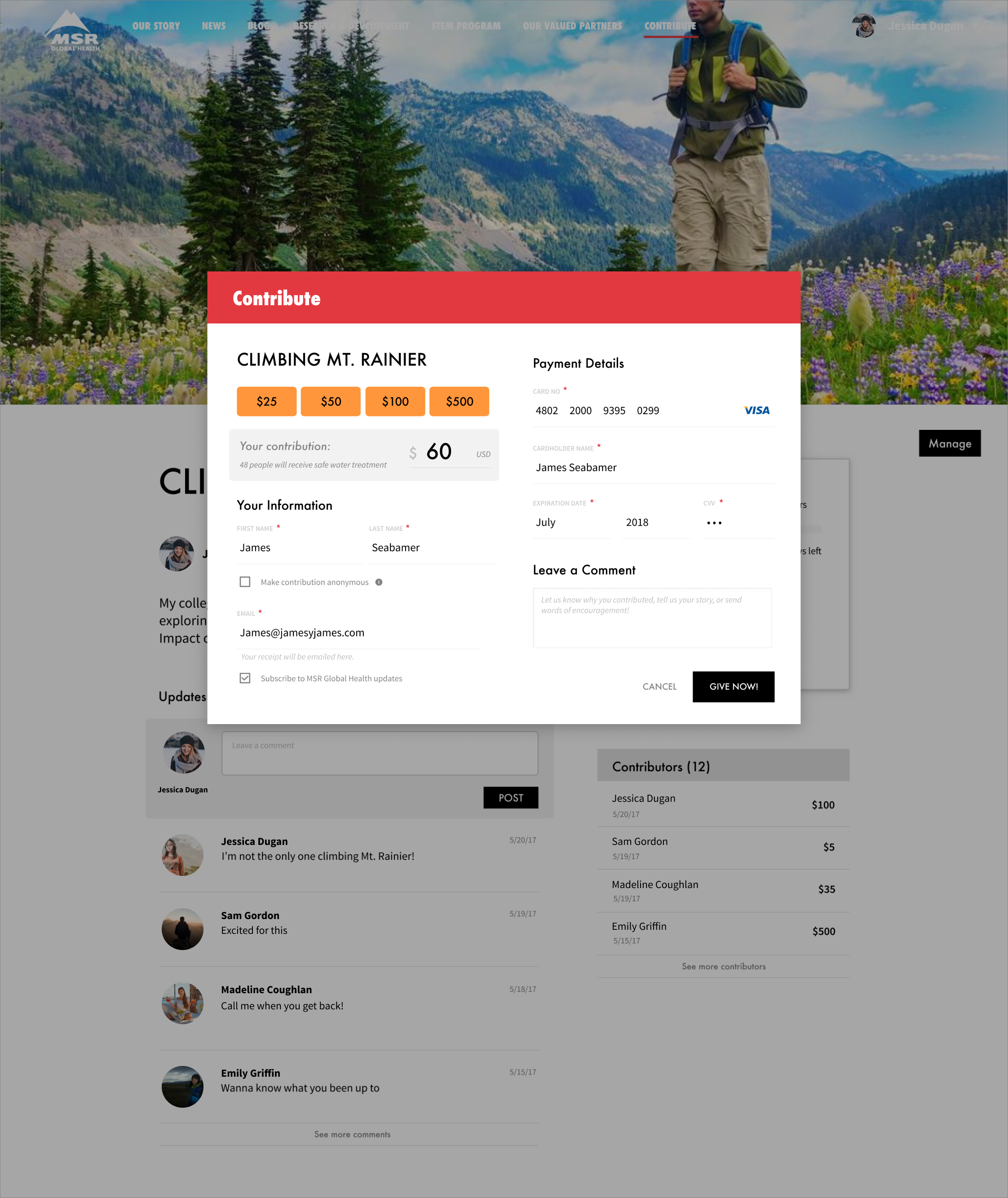
To address feeling secure, I experimented with color, switching the use of red and black color for the top bar of the popup and the submit button. The other major change was instead of “locking in” the contribution amount, it was freely adjustable within the popup. That made it easier to change the contribution amount at any moment.
Round 3
In the last version, did you notice the log in? It’s pretty hidden. One of MSR’s business goals was to get more logins so I pulled that out one step to give more attention to it.
The other main change is the interactive contribution suggestion. First time contributors often have a hard time knowing what amount is “good” so interactive contribution suggestions (quick buttons to fill the contribution amount) would help them get started.
In the previous design, it was also hard to tell how much impact a contribution would make. The suggestion description helps create empathy while also providing guidelines for contributing. Of course, users can still adjust the amount to their preference.