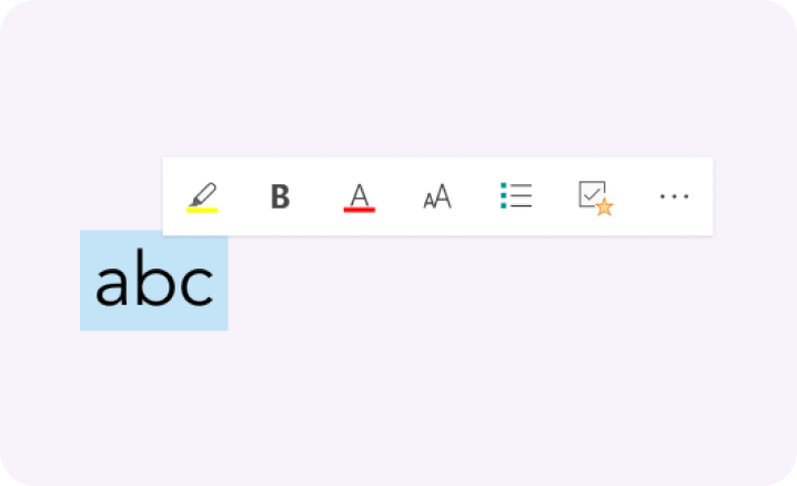


OneNote is a note taking app for all your notes, whether it’s for personal, work, or school. It’s like a digital notebook.
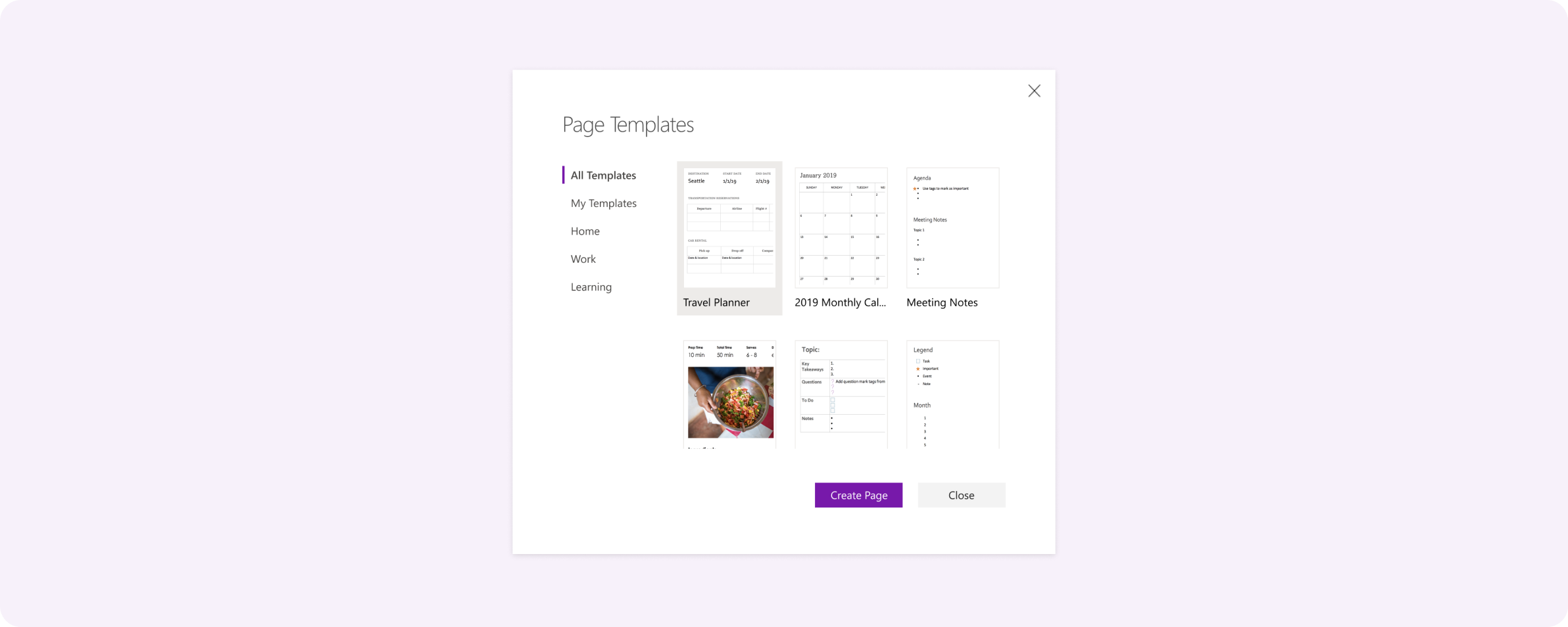
Page templates were a way to create new pages quickly based on a predefined layout. I designed the UX for creating new templates and adding a new page from a template. I also created a set of base templates to help users start off creating notes.
I really enjoyed this project because I got a deeper understanding of designing end to end and how design can impact the business.
Page templates was a feature that existed in Win32* OneNote and it was something that we knew power OneNote users needed in UWP* before they would be willing to transition to the platform. Page Templates are also known to be a great aid for new users who may need examples to get started and learn what OneNote has to offer.
*Win32 and UWP are two different OneNote platforms on Windows. UWP was a more modern but had less features than Win32 due to it being a newer platform.
My task was to bring this feature into UWP and redesign it so it is intuitive for new and existing users.
I knew this feature was highly requested but wasn’t exactly sure how it was being used or why they wanted it so much. I started out by defining the problem scope.
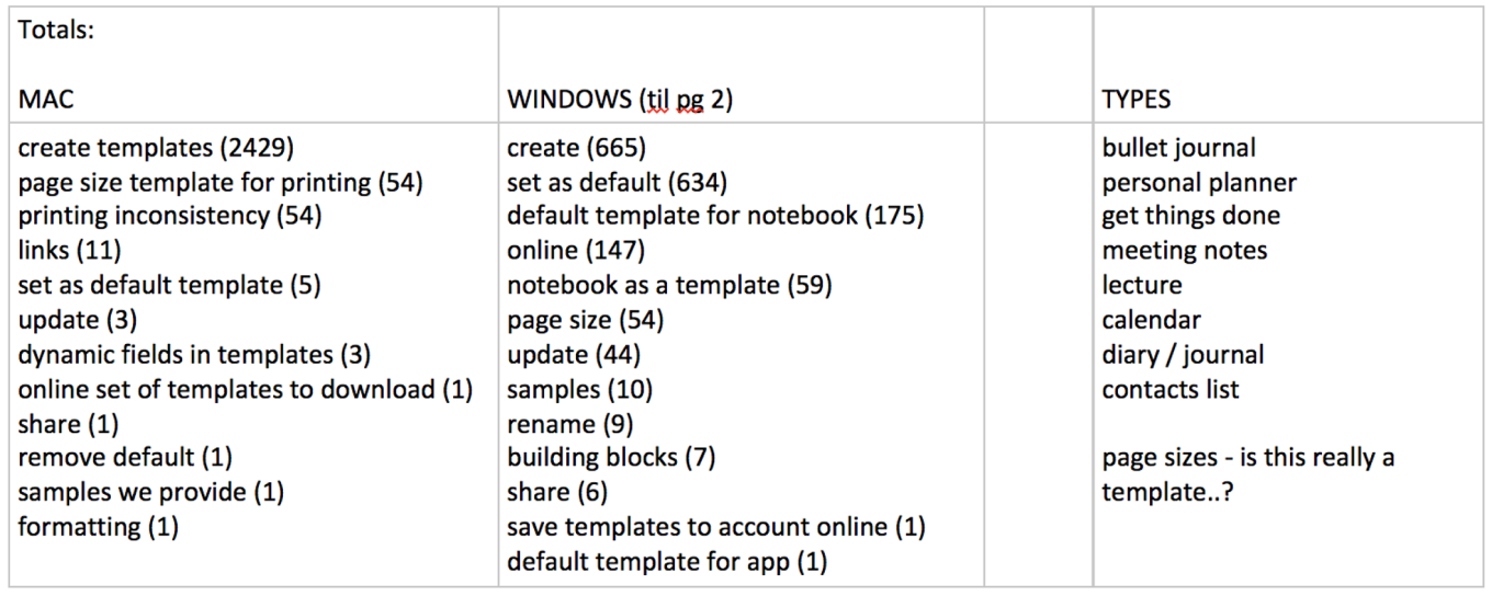
After compiling and analyzing our user feedback, I noticed trends starting to emerge on what people were specifically asking for. The top requests included being able to create new templates, set a template as the default new page created, and sample templates to build from.
I also did a deep dive on how our competitors handle templates and spoke with OneNote users like admins who used a workaround in UWP to get a sense of what different scenarios and needs for templates look like.
These insights helped identify two key problems to solve for.
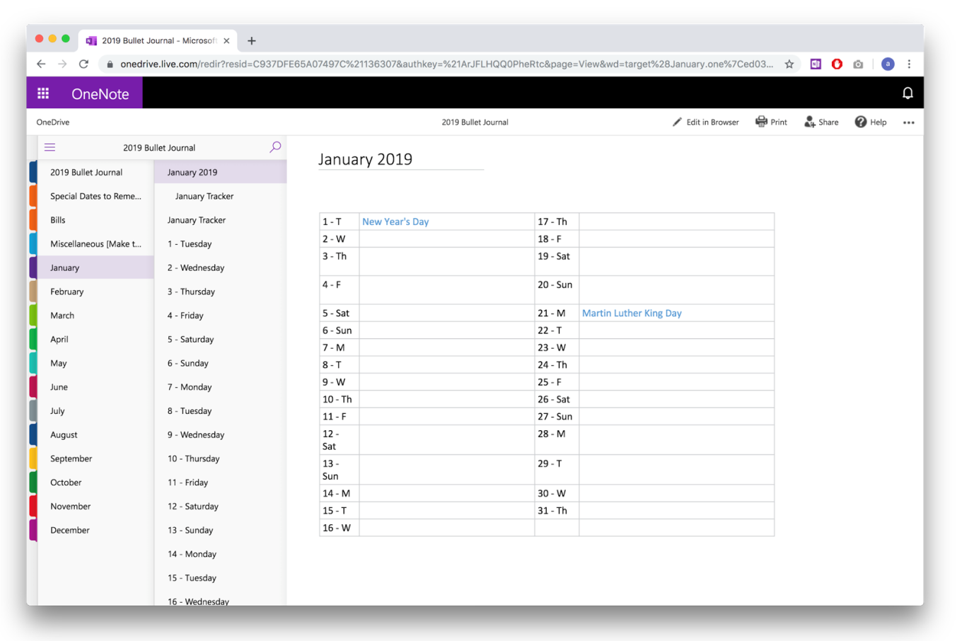
The first was the need for easier ways to get more structured notetaking. Many scenarios were cases where notetakers would have repeating information for each instance that occured. For example, noting the same information for different clients, or saving the same page structure for policies and procedures across teams or years.
Second, it’s hard to get started on writing something from nothing. For new users especially, it can be difficult to know where to start. Even for power users, an agenda template would help speed up creating new meetings.
From there, I decided to focus on 3 main user goals to target the biggest areas of opportunity.
- I want help starting out my note
- I want to set up my notes so every time I create a new page, it’s already ready
- I want to be able to create my own templates
User goal: I want help starting out my note.
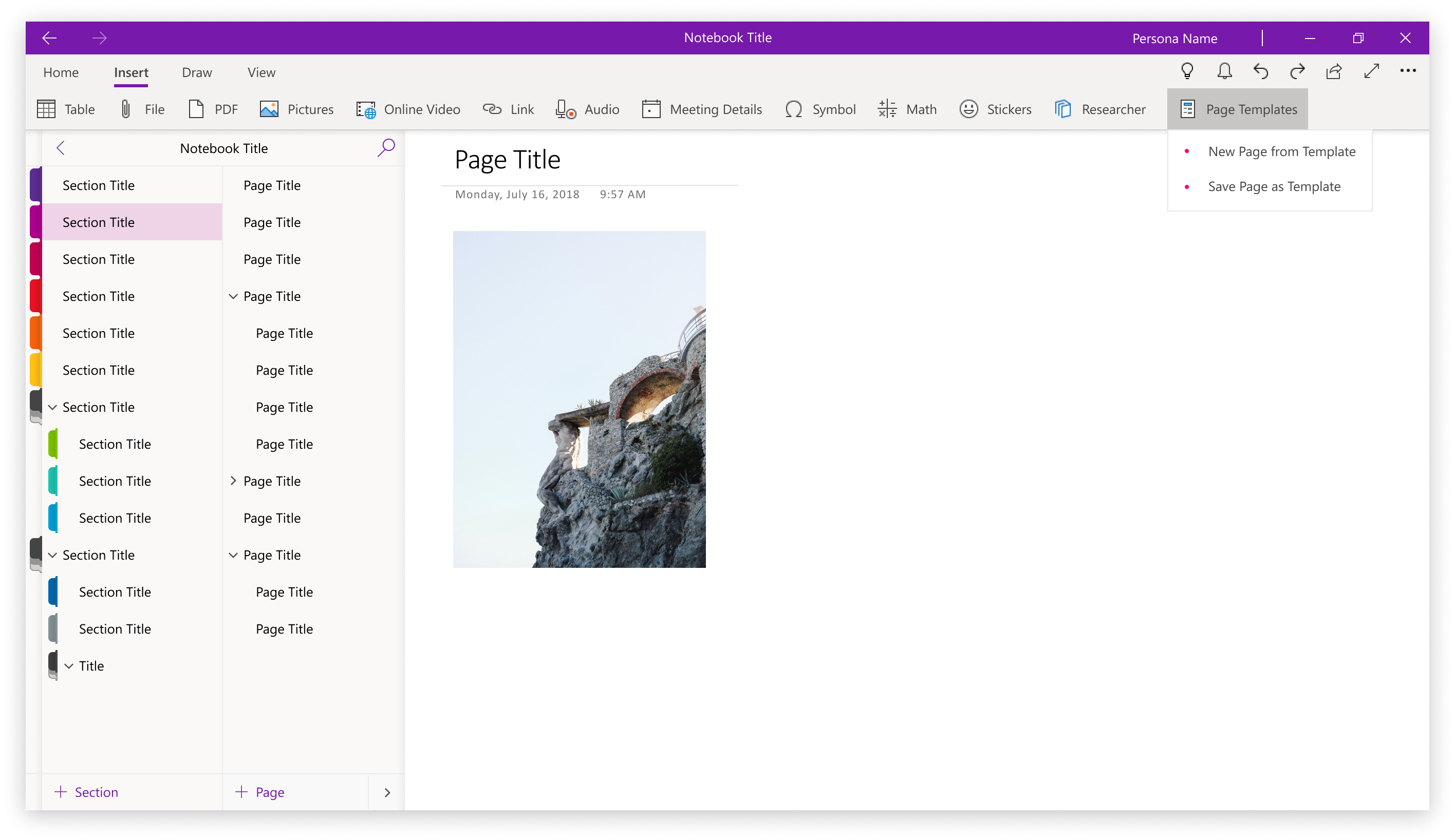
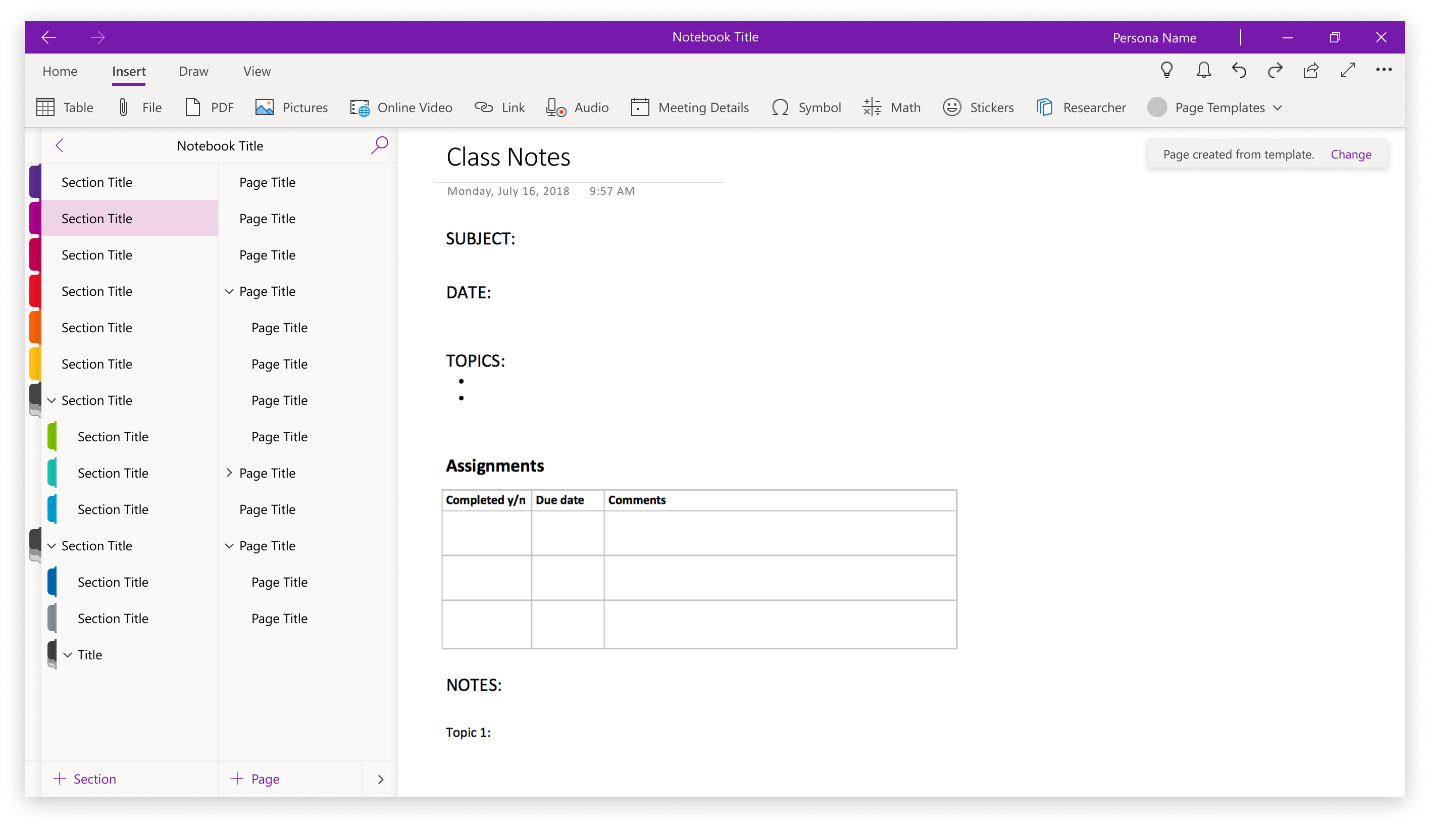
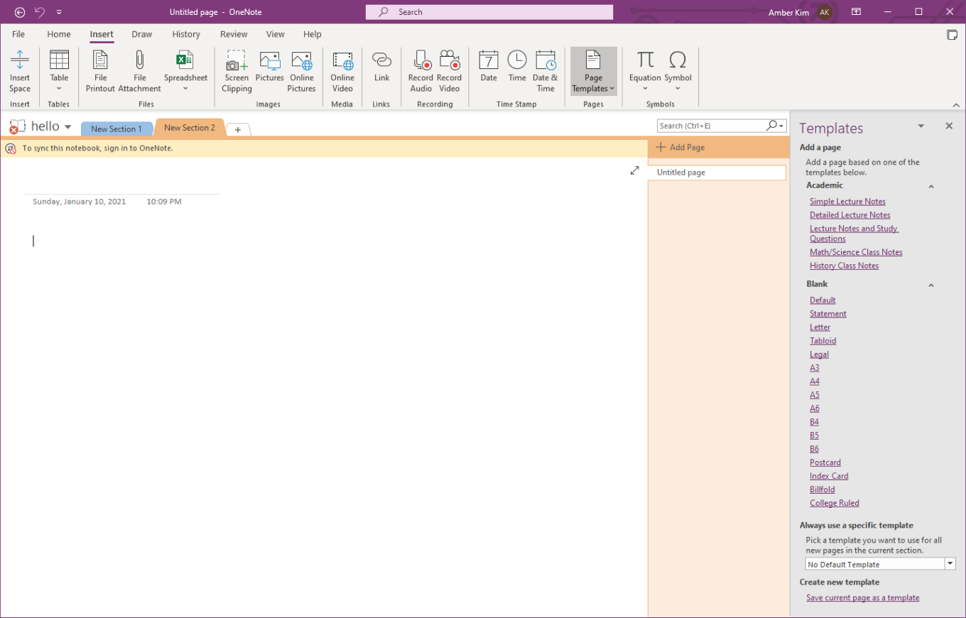
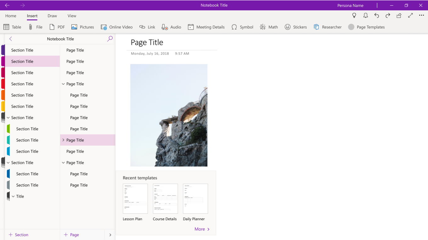
In Win32, Page Templates can only be accessed through the ‘Insert’ tab in the ribbon.
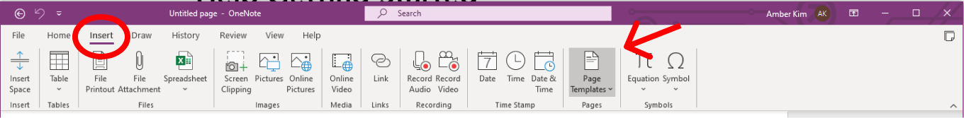
However this can be rather hidden, especially for new users who are already overwhelmed by the endless number of different features available in the ribbon.
Considering how beneficial templates can be for these new users, I wanted to highlight them in a location where they’re more likely to be found... and used. One of the ideas was intended to bring templates where it seemed the most relevant—when users are creating a new page.
To create a new page, users (especially new users) often click on the + Page button. Templates are generally used for creating new pages so the split button would bring that experience right where users are already going to create a blank new page.
Through some guerilla in-person testing, I found that while it’s convenient as a quick access to their page templates, many users didn’t want to manage their templates from within a split button and preferred managing them elsewhere.
For new users exploring OneNote, this quick access to templates would help them get started creating notes.
Experienced users would be able to quickly access their most recently used templates.
User goal: I want to set up my notes so every time I create a new page, it’s already ready.
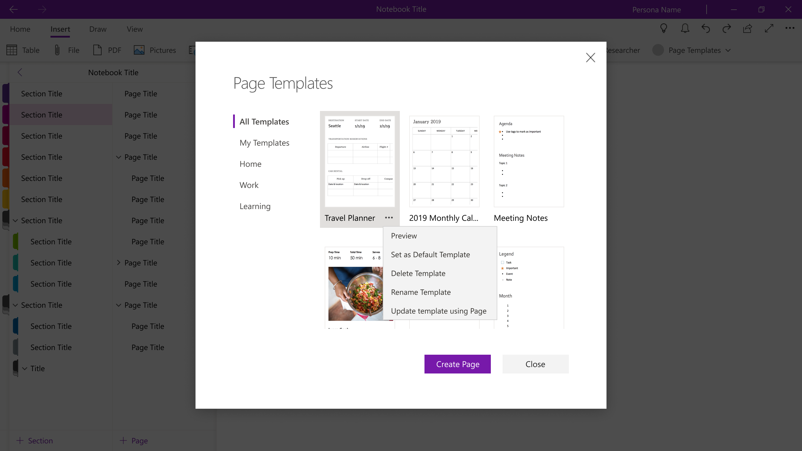
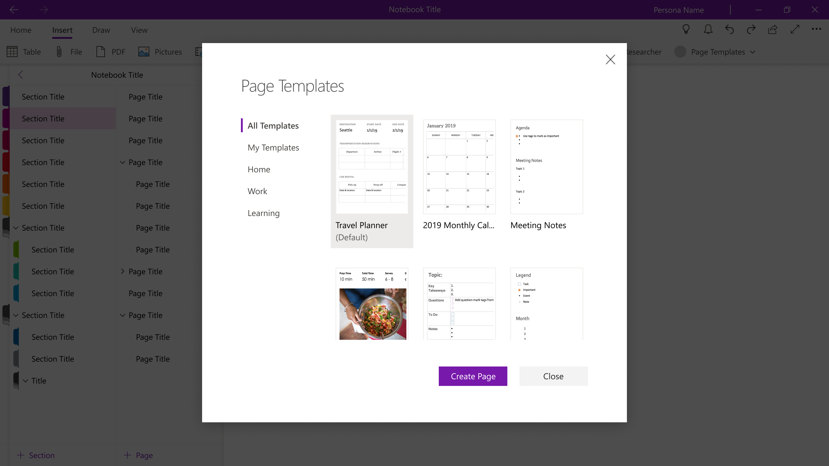
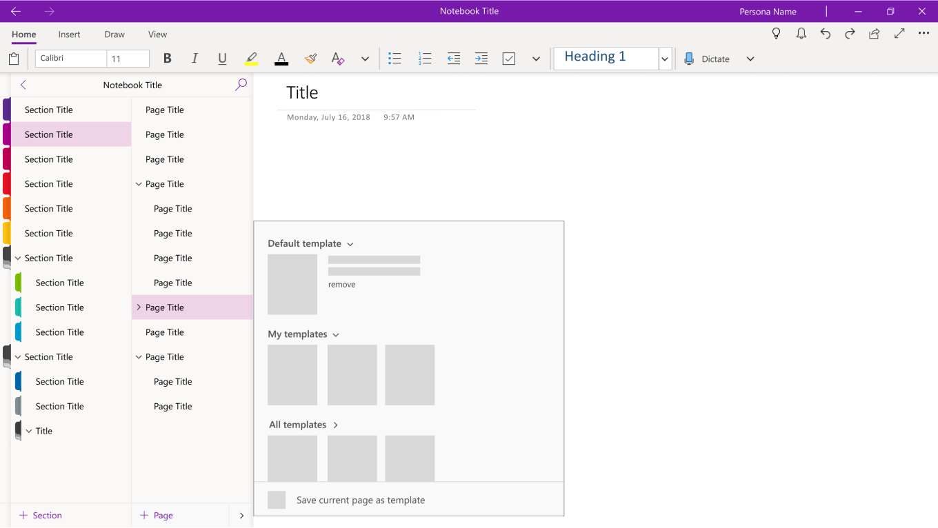
In Win32, users could set a default template for all new pages in the notebook section you were in. There were a two ways set it. One was using the designated default templates area within the Templates pane:
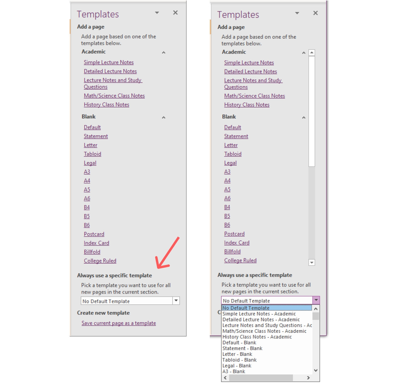
It would dropdown and repeat the list of templates directly above it. You would have to find the template you wanted in the compact list.
The other way was to right click on a template in the main browse view and set it as the default for the section via the contextual menu.
Pane vs. Dialog
One of the early assumptions the team made was that we would be building a pane. It probably came from the fact that it was in a pane in Win32 and could be referenced alongside your page, which seemed like a benefit.
However, after many iterations, I realized there was a limit to how much value we could see from the pane form factor. One limitation in tech was that we weren’t going to be able to drag and drop pre-made content into a page. This was a natural interaction many users attempted with a side pane so it was limiting when it wasn’t provided. In addition, if there was content on a page, clicking on a template could only either replace the content or create a new page. Being able to see the pane side-by-side introduced more confusion than it was useful.
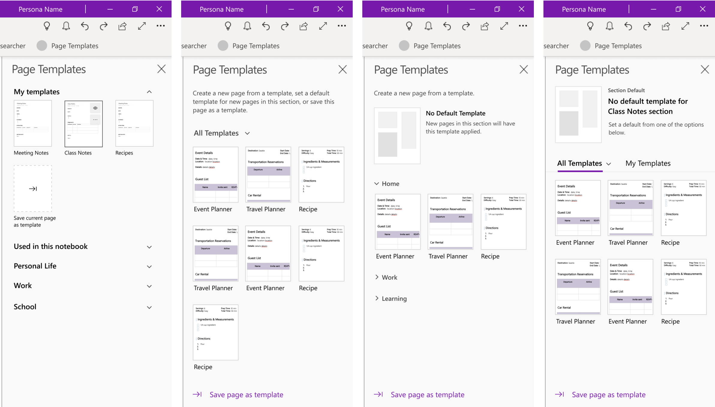
The main feedback I got from user testing was that creating templates was clear but default templates were confusing and there wasn’t a really simple but scalable way to navigate your templates.
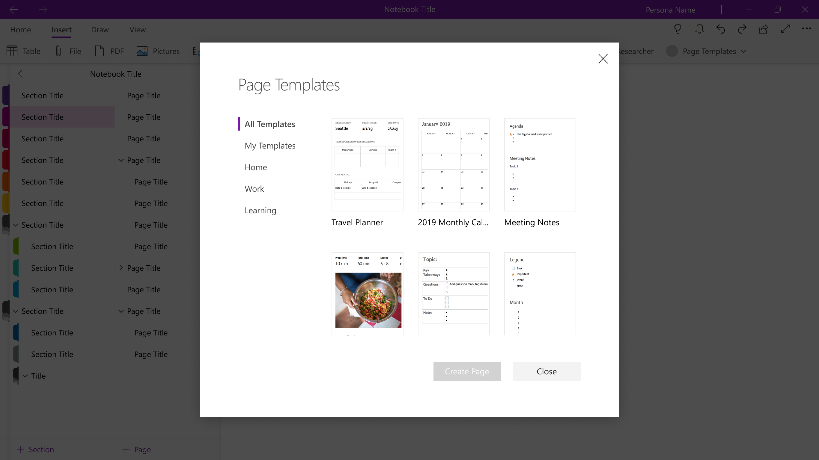
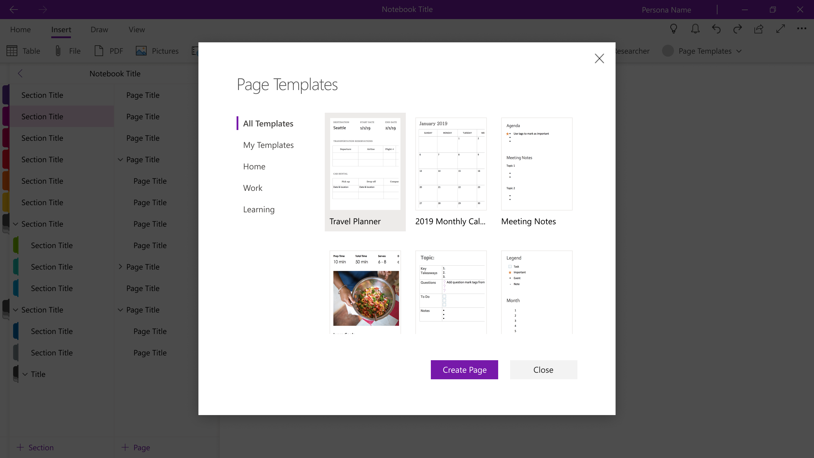
These factors undid much of the value we saw from using a side pane and I eventually pivoted the designs to a dialog.
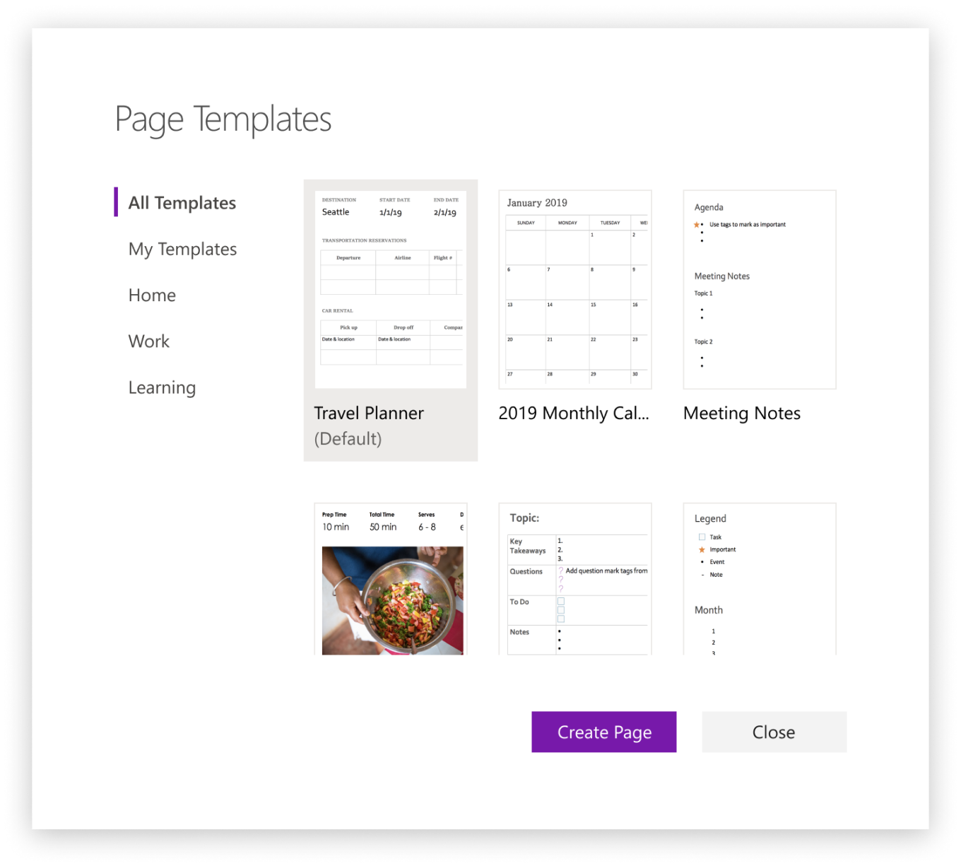
A dialog form factor was a more comfortable and natural space to browse templates and the default, when set, had a more visible preview. Compared to the Win32 design, there’s only one list of templates to browse and place actions on, simplifying and streamlining the process for multiple scenarios.
In addition, the nav scaled better than in the pane and since this dialog would pop open over the page and had a ‘Create Page’ action, there was also less confusion about what this experience would do upon completion.
Prototype demonstrating some basic behavior